20 Examples of The Best SaaS Pricing Pages
Last updated: September 3rd, 2024
An effective SaaS pricing page can be a powerful conversion tool. The challenge lies in finding the balance between functionality and design – it should give prospects clear pricing info while guiding them toward making a purchasing decision.
So, if your pricing page needs improvement, we have some excellent SaaS pricing page design examples to give you some practical ideas and inspiration. But first, let’s see what elements a successful pricing page should include.
What Makes a Good SaaS Pricing Page?
Just as the ideal SaaS website design follows a particular formulation, a good pricing page does the same. An effective pricing page needs to provide pricing information in a clear format that’s easy to understand, no matter how complicated it might be.
Key elements of a good SaaS pricing page include:
- Clear pricing tiers with, at the very least, a basic description of the included features
- Further detail on the difference in features and functionality between each plan
- Toggles or tabs to switch payment models
- FAQs section
- Social proof and customer testimonials
Now, let’s have a closer look at some stand-out SaaS pricing page examples and what design choices make them so effective.
Squarespace
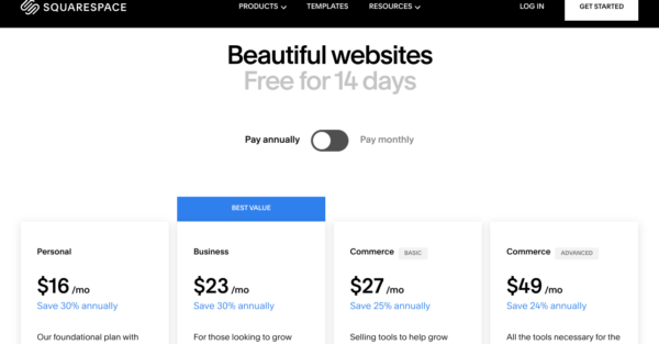
The Squarespace pricing page is a prime example of a good minimal design. It includes only the necessities – the pricing plan tier with a toggle option for annual or monthly payments. They’ve highlighted the cost savings if you opt for the annual payment method as well as the best-value plan.
They clearly display the main differences between the plans in terms of features and have an “expand” function so you can read more. There is an FAQs section at the bottom of the page and a link that leads to more information about their enterprise plan.
Asana
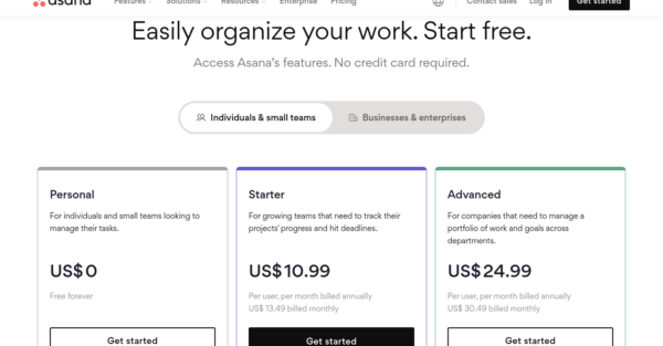
Asana has a neat pricing page, with their three pricing plans listed in a tier table format. Instead of having a toggle for annual versus monthly payments, they have a toggle for individuals and small teams or businesses and large corporations.
It’s clear how each plan differs from one another in terms of basic features, and you can expand to compare in more detail. They have also included trust badges from major partner organizations and some details on discounts for nonprofits.
At the very end of the page, they have their FAQs. The page has a very minimalistic design to help the prospect focus and find the information they need.
Keap
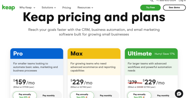
Keap have managed to fit a lot into their pricing page without it appearing overcomplicated or cluttered. They have three color-coded pricing plans, a toggle switch for the payment frequency, and an input box for the number of contacts you need.
They’ve listed core features for each pricing plan, but you can also see an expanded view of everything that’s included. They offer onboarding assistance with paid plans and have some information about that as well as the other additional support they provide. There are also customer testimonials and the usual FAQs.
Smile.io
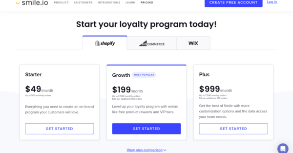
Smile.io has different pricing options depending on the e-commerce platform used, be it Shopify, BigCommerce, or Wix. To make all the information easier to process, they list the features in a comparison table with limited text and a tick if the feature is available. For those seeking even more information, an expanded feature comparison is just a click away.
There are also social trust badges and the all-important FAQs section. Rather than fill the page with more information, they’ve included some small sections and a CTA button for details about the free plan and alternative options for large corporations.
Zoom
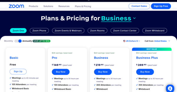
Zoom’s pricing and plan options are a little more complicated than some of the other examples here, but they’ve done well to display everything clearly. For example, each pricing category, like Zoom One, Zoom Phone, Zoom Rooms, and so on, comprises different pricing packages, like Basic, Pro, Business, and so on, which are well organized on the page.
Prospects can toggle between annual and monthly payment options and see how the free plan stacks up against the paid options. There is also an overview of the variety of add-ons available and a CTA button to find out more about Zoom features.
Towards the bottom of the page, there is a link for customer testimonials and social proof badges. This SaaS pricing page design manages to fit in a ton of information in a clear way because of the carefully thought-out layout.
Geckoboard
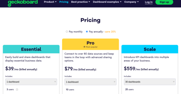
Geckoboard have a colorful pricing page that is neatly laid out. The three pricing options are presented in a quick overview tier with drop-down sections for the number of dashboards required. When you scroll further down the page, you can see more details about the features included in each plan.
Their page also includes social proof with badges from major companies that use their product and links to customer review websites. Finally, there’s an FAQs section categorized by pricing questions or questions about the product itself.
Unbounce
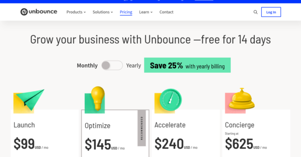
Unbounce have chosen a very minimalistic look to their pricing page. There’s large bold text and minimal details about each plan, and you can see a detailed comparison of the pricing plans by clicking on a CTA button.
They have included an eye-catching block with statistics that indicate how Unbounce can help your business. The page finishes with a FAQs expansion button and that’s it – short but effective.
ConvertKit
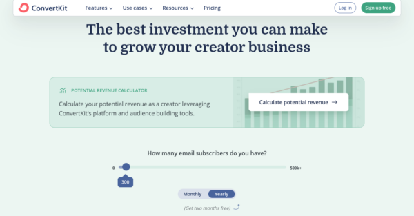
ConvertKit have a beautifully designed pricing page that is not only visually appealing but also user-friendly. This SaaS pricing depends on the number of email subscribers prospects have. So, to see accurate prices, prospects have to use the slider to select the number of subscribers they have, and can also toggle between monthly or annual payment options.
Depending on your selections, you will see the pricing for the three plans change accordingly. You can see a feature overview or expand for more detail. They have a carousel of famous customers acting as their social proof and an FAQs section.
At the bottom of the page, there is a CTA button to book a demo. At the top of the page, there is a CTA button to calculate your potential revenue.
ActiveCampaign
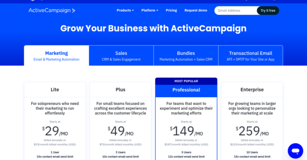
ActiveCampaign have been able to creatively fit a lot of information into their pricing page without losing any coherency. Prospects can easily navigate between various plan categories like marketing, sales, email, and customizable bundles by clicking on the tabs.
All plans are customizable, so you can remove or add features as needed, and you can also adjust the number of contacts you have. The pricing plans table has minimal details about included features, but you can expand it to get more information.
Towards the bottom of the page, there’s more information about the additional services ActiveCampaign provides and the integrations possible. There is a small FAQs section, and lastly, contact information to get more assistance.
HubSpot
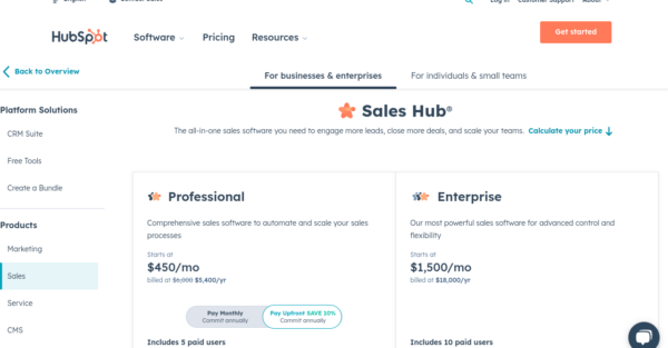
HubSpot’s large array of plans with different feature options is made manageable through their use of tabs and customizable comparison tables. Prospects can start by selecting plans suitable for large businesses or small teams and choosing a product from categories like marketing, sales, service, CMS, or operations hub.
Each plan is highly customizable, so prospects can adjust the number of users and add-on features as they scroll down the page. Once they’ve completed this, they’ll see a final price estimate.
This pricing page also includes some nice customer testimonials with specific details and statistics on how the product has helped their business. Despite the wealth of information, HubSpot manages to present it in a readable and accessible way.
Miro
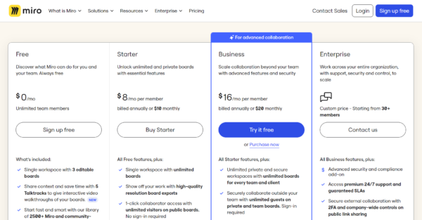
Miro’s pricing page is very informative and clearly structured. It displays its four plans and their respective costs with detailed descriptions of how the features can be used, which appeals to prospects’ need to visualize using the tool themselves. To promote and draw attention to the Enterprise plan, they have a separate summary and CTA that directs leads to the sales team.
What follows is a feature comparison table, which makes it easier to determine which plan provides better functionality for one’s needs. Social proof is included in the form of a rolling carousel of brand logos, and for additional assurance, they have included official data security certification labels. If a user is still on the fence at this point, there’s a downloadable “Why choose us?” document to give them that extra push. The page ends with a brief outline of a special package deal for those from educational institutions and an FAQs section.
Aircall
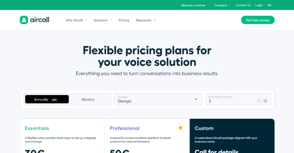
Aircall has done a really good job of making a potentially complex pricing arrangement look simple on their pricing page. There are three pricing options, and to get a correct price estimate for your needs, you have to adjust the location, provide the number of licenses required, and opt for either monthly or annual payments. Each pricing plan summary includes the price per month and year, as well as the core features included.
Two add-on options are displayed below the main plans, where you’ll also see social proof and testimonials from review sites like Capterra. At the bottom of the page, they’re getting serious about converting customers. There is a personalized quote form with multiple-choice answers to streamline the process and a CTA to get free access.
Mailchimp
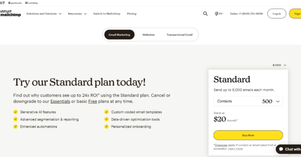
Mailchimp has a complex pricing page because of the three service options: email marketing, websites, or transactional email. Despite its complexity, the use of buttons and dropdown bars makes information easier to process.
What’s interesting about this pricing page layout is that while Mailchimp has 4 pricing plans, they focus on promoting the two most expensive ones: the Standard and Premium plans. This is a clever tactic to not only increase conversions but also the value of those conversions. In the feature comparison table, they make a clear point that the Standard plan is the best value option.
There are award badges from review sites like TrustRadius and G2 to signify the platform’s quality and popularity. Then, there are a couple of CTAs: one to talk to sales about migrating to Mailchimp and another to get access to a product tour. They finish up by targeting some of their niche users with CTAs about discounts for non-profits and the pay-as-you-go approach for micro businesses. The last element on the page is an FAQs section to tick off any remaining questions.
Airtable
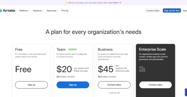
Despite being more concise than our other examples, the Airtable pricing page displays some very effective design elements that aid in converting customers. It starts with a clear pricing table with boldly displayed prices, highlighting the Team plan with a blue sign-up button and a “Try for free” text.
It continues with the optional AI add-on feature that has its own element block and a summary. The design feature we particularly like is the sticky table headings on the plan comparison table. As the user scrolls down, they don’t need to scroll back up to check which column relates to which plan. This streamlines the decision-making process and generally makes it easier for a potential customer to compare options. The page ends with a questions section addressing common plan and billing queries, along with an FAQ section.
Figma
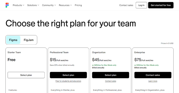
The Figma pricing page makes excellent use of sticky heading bars and color to draw attention. There are two products available, Figma and Figjam, which can be toggled between to see the different pricing options. This toggle heading follows the prospect as they scroll down the page so they can switch between the two products at any point.
The first table is a summary pricing table listing all four plan options, costs, and accessible features. Then, a contrasting banner acts as a page break and displays an add-on feature. The next element on the page is the full feature comparison table, which also has a sticky heading bar that follows the user down the page and bright contrasting green ticks to indicate a feature’s availability. This color contrast is a great way to help readers absorb information faster. The page ends with an FAQs section and a carousel of social proof logos.
Coda.io
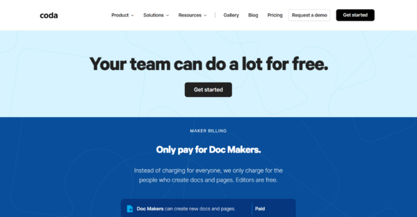
The Coda.io pricing page starts with a CTA and a simple pricing calculator that displays a price breakdown based on the team size and the number of document makers required. The pricing plan summary table gives a clear rundown of the monthly price and the features available. If you hover the mouse over a feature, more information will pop up. Then, there’s a CTA to sign up or try it for free, alongside information about the Coda AI functionality.
The plan comparison table is very neat and detailed. They have chosen not to fill the table with text and instead allow additional information to pop up when the cursor hovers over an item. A particularly nice design feature is including integrations as logos rather than text. This visual approach makes it easier and faster for prospects to process the information and provides some variation in an otherwise text-heavy table. They complete the page with an FAQs section.
Chargebee
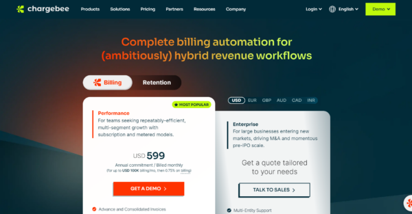
Chargebee take a different approach to their concise pricing page design. They have three pricing options arranged in distinctly different-sized boxes. This intentionally draws the user’s attention to the paid performance plan rather than the free Starter plan. Each summary covers who the plan is best suited for and the included features. It’s also possible to view the price in 6 different currencies.
A “Compare Plans” option provides more detailed information via pop-up. There is a minor addition of social proof and customer testimonials, and the page ends with an FAQs section.
Clarifai
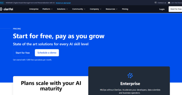
Clarifai have a pay-per-usage pricing model, which at first glance looks just like every other set pricing plan. However, to understand what each function costs, you have to download the price list. They’ve done a very good job at making a potentially complicated pricing system very transparent and easy to understand.
Each plan has a dollar amount of credits and different functionalities that are enabled depending on the selected plan. This is clearly outlined in a comparison table. Towards the bottom of the page, they’ve included a lead magnet designed to provide more information about the product and move the lead through the sales funnel. This is followed by details about additional services and an FAQs section. The very last element on the page is a contact capture form with CTAs to book a demo or get started for free.
Vidyard
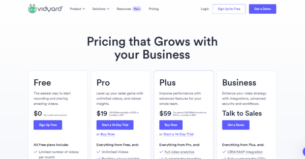
Vidyard is yet another good example of a simple, clean, and effective pricing page. The four pricing plans are displayed front and center, with the price and essential features outlined. As prospects scroll down, they will see a section promoting the business add-on, followed by compelling social proof.
The page showcases results achieved by key clients and awards from G2, an independent review platform. A comprehensive comparison table then details the features and functionality of each plan. To further build user confidence, Vidyard includes additional social proof in the form of G2 review snippets. The page concludes with an FAQ section and a call-to-action (CTA) to book a demo.
Hypefury
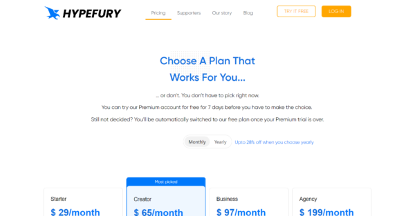
Hypefury’s pricing page begins with a concise summary of its four pricing plans, followed by a detailed comparison table. Unlike many competitors, they’ve positioned their FAQ section immediately after the pricing comparison, rather than at the bottom of the page.
A standout feature of Hypefury’s pricing page is the inclusion of detailed product benefits information, complemented by animations demonstrating the product in use. This approach allows potential customers to gain a deeper understanding of the product without leaving the page. The page concludes with a CTA to try the product for free. While extensive, the page provides comprehensive information that helps prospects decide what plan is best for them.
In Summary
As you can see, the main goal is to keep the user on the page, minimizing external links that could lead them elsewhere. You’ve also probably noticed that many examples utilize expandable sections, keeping the layout neat while offering additional information as needed.
If your SaaS pricing page isn’t performing optimally and has high bounce rates, perhaps it’s time to revisit your content marketing strategy. Powered by Search can help with all things content marketing and will have your SaaS business on the right track in no time.
Curious to know where your SaaS company stands against the rest? Take the SaaS scalability score self-assessment to find out.
What you should do now
Whenever you’re ready…here are 4 ways we can help you grow your B2B software or technology business:
- Claim your Free Marketing Plan. If you’d like to work with us to turn your website into your best demo and trial acquisition platform, claim your FREE Marketing Plan. One of our growth experts will understand your current demand generation situation, and then suggest practical digital marketing strategies to hit your pipeline targets with certainty and predictability.
- If you’d like to learn the exact demand strategies we use for free, go to our blog or visit our resources section, where you can download guides, calculators, and templates we use for our most successful clients.
- If you’d like to work with other experts on our team or learn why we have off the charts team member satisfaction score, then see our Careers page.
- If you know another marketer who’d enjoy reading this page, share it with them via email, Linkedin, Twitter, or Facebook.